Valentine's Day

I made this for Staci for today.
It was inspired by a 50's romance comic panel that's been floating around forever. It was finished pretty quickly, just took a couple of hours. It turned out pretty okay, but looking at it today, I could've worked on the colors a little more. That cyan is still seems pretty pristine and vivid.
It's not so much "working on the colors" as it is grinding them into glass. I haven't gotten around to committing it to paper yet, but I'm slowly working out my own printing terms for old printing (error and artifact) effects. I plan to make a numbered chart with examples of them, and use that whenever I color something like this. Then, whenever I color something like this, I'll roll a dice for how many effects, which ones, and where to put them.
Then all the effects and fake errors will be up to chance, just like when stuff like this was printed.
Whatever can add a little more authenticism, I guess.
A new thing I tried on this was to try to vary the tones. The tones on the moon are the easiest to see. The tones aren't uniform- some are bigger, some are smaller, some are touching, some are oblong. I'm proud of that, that was hard to figure out how to do. Now that I know that'll work, I can push that effect a little further the next time I color something.
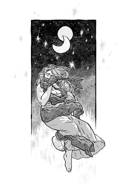