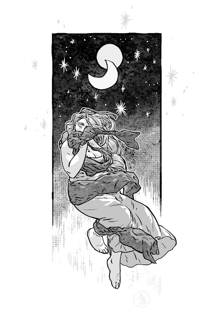
More Colorin'
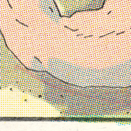
There wasn't really a way to crop an interesting section of this without revealing too much, but this does happen to have some hard to reproduce printing errors. They're not hard to reproduce technically, like, know-how, they're hard to pinpoint exactly what you want to reproduce and then remembering to go out of your way to put it there later. It's also hard to make intentional errors look unintentional. Adam Savage explains the idea pretty well whenever he talks about weathering props.
I remember reading an interview with Katsuhiro Otomo and he was talking about a time when he had to arrange three rocks- he kept trying different arrangements all day, but they kept looking staged and unnatural. As a last ditch effort, he just threw them up in the air and they landed perfectly. Point being, intentionally unintentional things are very hard to pull off.
The key is something like loud subtlety. There's a streak of magenta and some drips of yellow.